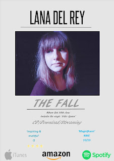
I have started drafting my magazine advertisement for my chosen artist and think that it is coming along quite well. I wanted to go for a simplistic look rather than a busy one as I feel that a more simplistic looks more professional but it is still eye catching. I used simple colours also (blue, black and grey) because I didn't want the colours to be too bright or blinding and this colour scheme fits with the one on my digipak. I didn't want my image of my actress to be too big or to cover the whole advertisement so I kept it smaller but made sure it was still noticeable as I feel that text over this image would not look nice or professional. I also made sure I included downloading, CD and streaming for the album to let people know how to access the album - I used iTunes, amazon and spottily as a main source of accessing the album. I'm really happy with my advertisement so far but I think I will tweak it a little bit to make the text fit better.

No comments:
Post a Comment