Megan Do's A2 Media Studies Blog
Saturday, 9 April 2016
Tuesday, 29 March 2016
Tuesday, 22 March 2016
Organisation / Drafting & Planning: Footage
As mentioned in a previous post, I have filmed my actress holding cards for my music video. The lyric that this clip will fit with is 'playing pool and wild darts'. This was very aggravating at first because it was impossible for me to get a pool table or a dartboard from somewhere or to go somewhere with my actors to access these so I had to substitute this by using cards instead. I think cards are a good substitute as people 'play' cards and it still insinuates the playing of a competitive game. I'm happy with this footage and just hope that it will definitely fit with the lyric in my music video.
Monday, 21 March 2016
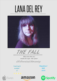
Drafting & Planning: Magazine Advertisement
I have started drafting my magazine advertisement for my chosen artist and think that it is coming along quite well. I wanted to go for a simplistic look rather than a busy one as I feel that a more simplistic looks more professional but it is still eye catching. I used simple colours also (blue, black and grey) because I didn't want the colours to be too bright or blinding and this colour scheme fits with the one on my digipak. I didn't want my image of my actress to be too big or to cover the whole advertisement so I kept it smaller but made sure it was still noticeable as I feel that text over this image would not look nice or professional. I also made sure I included downloading, CD and streaming for the album to let people know how to access the album - I used iTunes, amazon and spottily as a main source of accessing the album. I'm really happy with my advertisement so far but I think I will tweak it a little bit to make the text fit better.
Saturday, 19 March 2016
Drafting & Planning: Digipak
I decided to change my digipak again as I felt that something was missing. I changed the colour of 'The Fall' on the CD front cover as I feel that the light gray is better than the light blue as the blue does not tie in with my other products (mentioned in a previous post). I also added an image of darkened trees and leaves inside the CD for the inner tray/sleeve as I felt that a plain black background was too boring and dull. The original image was quite bright but definitely fitted my theme of autumn/fall as there are a lot of dead leaves on the ground and bare trees so I just darkened this image to make it fit with the dark lighting and tones on the rest of my digipak. I also used this image as there are dark leaves on my CD back cover and on my CD disc. I'm really happy with my digipak and feel that I have chosen the right images and fonts to make it successful.
Monday, 14 March 2016
Drafting & Planning: More Footage
I decided to film some more footage to fill in the gaps in my music video where my older footage did not fit. I feel that these small snippets are much better than my other footage as they fit with my chosen song and the lyrics in the song. I'm glad I decided to film more footage and glad that they came out pretty decent.
Subscribe to:
Comments (Atom)


